
Now you think: “Wait, what…? I thought that photography is the art and that it can’t have any rules. Then you tell me that there are some rules after all… And just when I have finally accepted that, you want me to break them? What the heck?“
And yes, you are right about everything. Photography really is the art, and whatever you create will be great, because it is your unique way to express what you see. Noone can tell you that your photo is bad because you broke some rule(s).
But ever since the ancient times the artists (painters, sculptors, architects…) knew some things about the human eye that you should also know and maybe (just maybe) you should try to create your photos according to those facts. So we’ll just call these things – rules (because it’s easier and faster to say or write “rule” than “a fact about a human eye which will make you consider the way of creating photos so that they can become more appealing to the viewer“).
And finally, when you learn these rules, you will learn how to break them on purpose, in order to make your photo even more appealing than if you were following the rules. Simple, right? 🙂
I decided to write about these rules today because I feel that the previous lessons were just the right amount of technical things that you, as a beginner, should know about your camera. Right now you know how to switch to a mode that you want, which mode is better for which occasion, how can you determine if your photo is well exposed… and regarding the technical stuff that should be enough for the start. In a while we will talk about some other settings which will give you even more creative freedom and will let you further improve your photography skills.
Ready? Great! Let’s start with the rule #1…
Rule of thirds vs. Golden ratio
You have probably heard about these things a thousand times. What are they and how can you apply them?
For the rule of thirds the point is to imagine four lines dividing your frame into thirds, both horizontally and vertically (on modern cameras you can even see those lines while taking a photo, you don’t have to imagine them). Then you should try to place the most important object of your photo on one of the four points where those lines intersect.


Also, if you place your subject in the dead center the photo will look static, maybe even boring. If your subject is slightly off the center, it will create the sense of movement, and the photo will be more dynamic. Take a look at this photo which was cropped in two different ways for the purpose of this lesson:


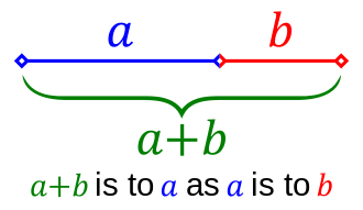
There is another similar rule which propagates the use of golden ratio. Two numbers a and b have golden ratio if their ratio is the same as the ratio of their sum to the larger one of them: (a + b) / a = a / b = ϕ
In geometry we can represent that ratio using a single line, or a rectangle:
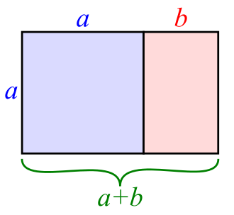
So far you can see that the golden ratio divides a rectangle almost in the same place where its third would be. So what’s the difference?
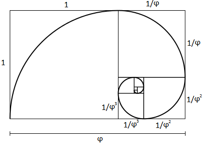
There is also something called golden spiral. In geometry, this is defined as a logarithmic spiral whose growth factor is ϕ (the golden ratio):

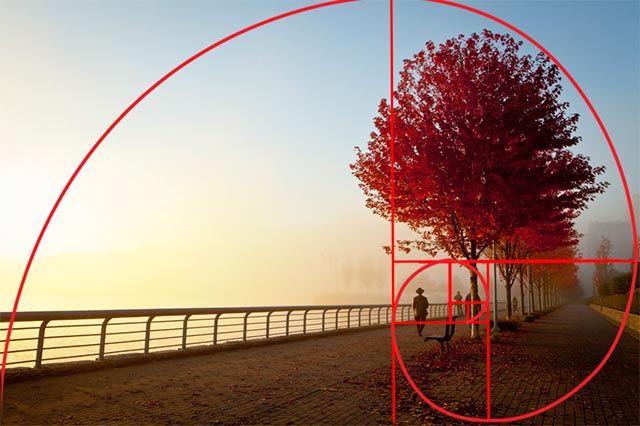
You can rotate or mirror this spiral anyway you want. Then you should try to make your composition so that the spiral is leading the viewer’s eye all the way down to its center, where your main subject should be placed. Take a look at the photo that I found on this site, which demonstrates the use of this composition technique:
These rules are not something that I came up with, nor they are the invention of some modern fancy photographers. They were used even by ancient artists who found out that the human eye will not focus on the center of an image, but instead it will roam around and will most probably focus somewhere slightly off the center. Therefore the picture with the most important elements placed in the thirds or in the “golden” areas will look more beautiful to the viewer.
Did you already use one of these techniques? Did you see the difference? Leave a comment and share your experiences. And of course, share this text if you like it 🙂
In the next post we will continue with the rules which are meant to be broken 🙂
See ya soon,
V.
