Rules and How to Break Them – Frame Inside Frame

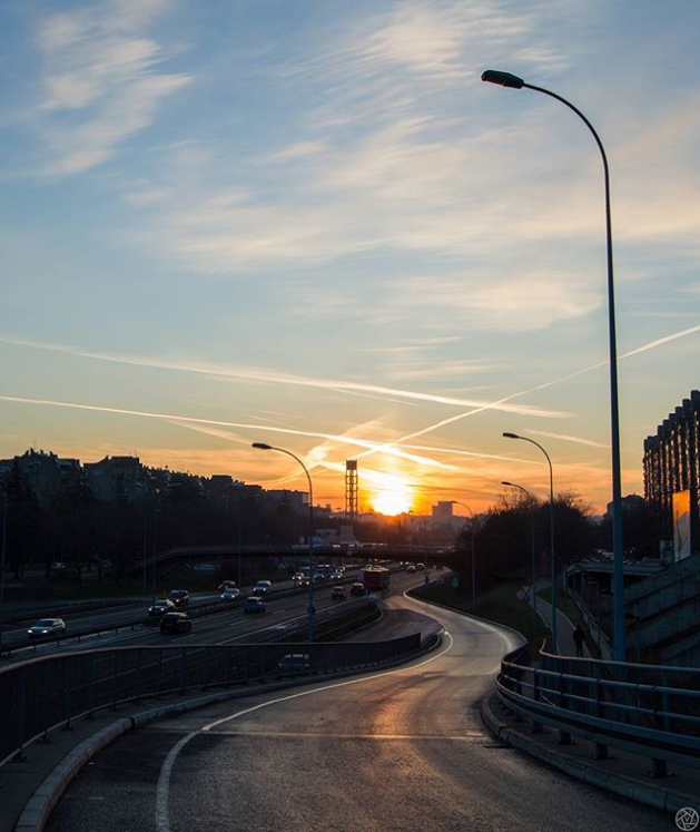
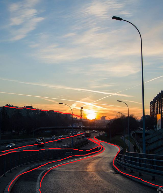
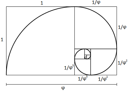
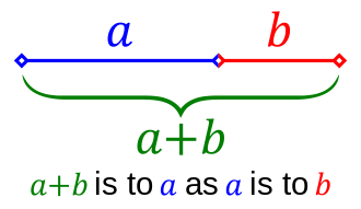
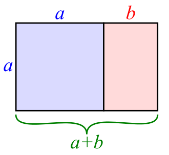
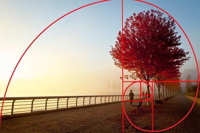
Just as a reminder, in previous posts you could read about rule of thirds, golden ratio and golden spiral, then about leading lines and finally about filling the frame and orientating your subject towards the center of the photo.

Today we will talk about making a frame inside a frame. “Wait, what?“, you ask. Well, it’s simple. There is one rectangular frame that you always have, and that frame is made of your photo’s borders. Often it would be a good idea to create another frame inside of it, which will contain your main subject(s). That “inner” frame could be made of whatever you find when taking a photo. You can use tree branches, bridge arcs, doors, windows, or anything else. You just need to position yourself so that your subject will be visible through that frame and you just point your camera and shoot through it.

I will share some of my photos, it’s always better to learn from practical examples 🙂

frame1a

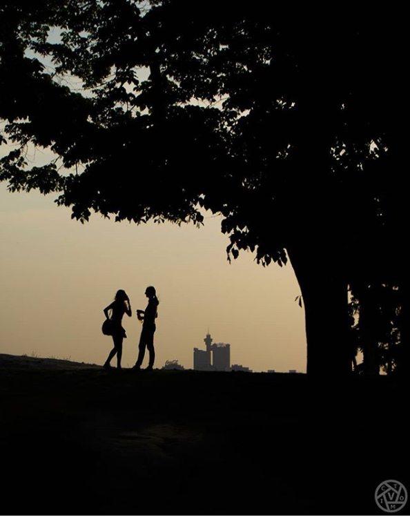
This is a silhouette of two girls talking to each other. This photo might be interesting, but… It looks somehow unfinished, I have a feeling that something else is out there, that I don’t know the whole story.

frame1

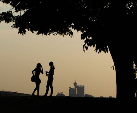
This already looks better to me. Now there is a border around the girls, and I know that they are the main focusing point of the photo, there is nothing else around which is more important. This was the final version of the photo, but when I look at it now I feel that there is too much black area, so I might just re-crop it:

frame1b.png

Now it looks perfect to me. The girls are placed using a rule of thirds. Maybe you can also imagine a golden spiral starting from the upper left corner, swirling around and ending up just at the place where the girls stand. And I still have a nice frame made of the ground and the tree. Of course, it is not mandatory that the frame has all four sides.

Let’s have a look at the next example:

frame3a

A photo of the Alps, taken through the window plane. Beautiful sight, it really is. There is also a part of the engine visible, so that the viewer knows that this was really taken from an airplane (wow, look at me, I was flying and I bragged about it on social networks!). The sky is ice and blue, while the white mountains make a nice contrast… But do you really like this photo?

frame3

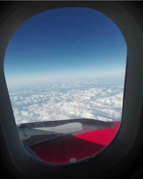
Much better, if you ask me. Not only that a viewer will now have the same perspective as I did when I took the shot, but the main scene will be somehow surrounded and will be one single entity. In the first version I wouldn’t know where to look – should I concentrate on the sky, on the mountains, on the engine…? Now I know that the whole scenery and all of its elements make a single image which should be enjoyed wholly.

The last one:

frame2a

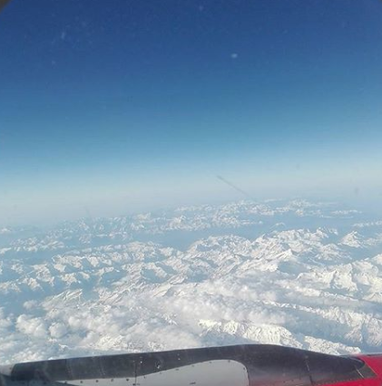
A woman is walking down a sunny street… well, ok. Good for her, right? But let’s take somewhat wider look:

frame2

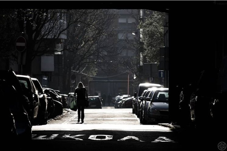
Now we have totally different story behind this image. We know that she has passed through a dark passage, we have a strong contrast. We can also see the label on the road, which says “SCHOOL” (in Serbian), so that also adds up to the all the different story possibilities that a viewer has. Besides that, we got the additional sense of depth, with some barely visible cars in the shadow, which form a nice leading lines together with the cars in the sun, and they are leading our eye to the distant point where this lady is headed. And some additional black border on the right side created a different composition so that the woman is right in the first third of the photo.

You know what’s next. You should take your camera, go outside (or stay inside if you have enough material for photography), and try to make some photos which will have a frame inside a frame. Come back after that and share your thoughts in the comment section.

See you soon 🙂

Rules and How to Break Them – Fill the Frame & Face Towards Center

Here we are at the third part of our photography rules collection. Today we will talk about a couple of things. For the beginning, let’s talk about how and why you should fill the frame.

It’s all about… well, about filling the frame :). You want to zoom in as much as possible (either using the zoom capabilities of your lens or by walking closer to your subject), so that you don’t leave much (or any) empty space around it. Your whole frame should be filled by your main subject.

This rule is important when you are taking a photo of a single subject. Maybe it is a flower, or your pet, or a human portrait… The flower is small anyways so you don’t want much of its surroundings included, because it will only distract a viewer from the flower itself. The same is with your pet. Zoom in and make that cute dog really be the main star of the photo! When making portraits of people, especially if they have interesting face contours and details, it’s worth leaving everything else out of the frame and making that wrinkles or that scar or that beautiful eyes stand out, because after all that’s who your subject really is. Be careful though, and don’t crop your model too much. I will make another post about cropping so you could see how you should and how you shouldn’t crop a portrait.

But then again, you might have more than one subject. You might be photographing your plate with several kinds of food, or a basket full of different fruit, or maybe two people holding hands… It would again be better to zoom in and even to crop a little bit, so that only the food stays in the photo (or the fruit or the two hands).

Let’s take a look at an example. What do you think about this photo of a lion?

zoo (3)-3

Ok, it’s an interesting lion, he has a nice “haircut”, looks curious, and he’s looking straight into the camera. Not bad. But there is much more in this photo, there is too much information which distracts a viewer’s attention. Those rocks at the bottom, then the ugly fence behind the lion, more rocks in the background, some grass, some concrete, then some flowers which are also a bit distracting. The lion is placed in the very center of the frame, like the rule of thirds doesn’t exist at all… Actually, I’ll be honest, this is a photo that I’ve published on Instagram a while ago and at that time I thought it was really great.

Now take a look at this one:

zoo (3)-4

Looks better, right? I want my viewer to focus on the lion’s head, and I also included a bit of its magnificient mane. I placed its eye right in the intersection of the lines which split the image into the thirds. I removed all of the useless information from the background. No more fence (ok, a little bit in the top right corner, but maybe you didn’t even notice it), no more rocks, concrete walls, flowers… Only the portrait of this beautiful lion in all its glory.

The other rule I want to mention should be applied in cases when you don’t fill the whole frame. That rule says that your subject should face towards the center of the photo, and not outside of the photo. Let’s have a look at another photo of the same lion:

zoo (4).jpg

It seems logical, right? The lion is looking “into” the photo, everything is in harmony. Can you imagine if the camera was moved all the way to the left, with the lion’s head on the right side, looking outside of the photo? It would look weird, right? What is he looking at? Why is that not in the photo? Why is he trying to “escape” the frame? It’s just wrong!

To be honest, I was trying to find a single photo in my portfolio where the subject is facing outside the frame, but I couldn’t find it, because it just feels wrong to me to take that kind of photo 🙂

That would be it for today. In my opinion, after these few lessons you can already grab your camera, go out and start taking photos while trying to apply these rules. And don’t worry, this is not the end of the lessons, in a few days you will be able to read about some more rules. I just want you to start applying what you have read so far, because it’s the best way to learn.

Give me a comment – what do you think? Are you already using these rules in your photos? Share this text so your friends can also see it. And I’ll see you soon with new rules 🙂

Rules and How to Break Them – Leading Lines

In the previous post we started talking about some composition rules and principles in photography. We covered the rule of thirds, the golden ratio and the golden spiral. Following them will give your photography more dynamic look and feeling.

The next principle that I’d like to talk about are the leading lines. When creating a photo you should include some lines in it (either straight or curved), which will lead the viewer’s eye “into” the image, all the way to the main subject. Those lines should ideally start from one of the corners of your image (I prefer the bottom left corner), and then make their way to the subject. You can use anything for the leading line – a road, a fence a rope, a plane exhaust gases trail, a river… anything that can fit into your frame.

Take a look at this photo of Zürich:

leading1a

Do you see where I was trying to lead your eye? You will start from the bottom left corner, and go along the rail all the way down to the church tower and a nicely-lit bridge over the Limmat river. There is also an auxiliary line which is formed of the rooftops, and helps your eye go to the right and not wander to the not-so-interesting black sky.

leading1b

Let’s take a look at another one. I wanted to take a photo of a rising sun, but also I tried to compose a photo so that there will be something in it which will lead you to the sun itself.

leading2a

So there is a highway and a connecting road, which converge just a little bit under the place where the Sun is located. And also some rooftops from the upper side.

leading2b

Did you already take some photos which follow this principle (either willingly or just by accident)? Leave your thoughts in the comments, share this post if you like it, and see you soon with another photography rule which is meant to be broken (at the end of this series). Bye bye 🙂

Rules and How to Break Them – Rule of Thirds vs. Golden Ratio

Now you think: “Wait, what…? I thought that photography is the art and that it can’t have any rules. Then you tell me that there are some rules after all… And just when I have finally accepted that, you want me to break them? What the heck?

And yes, you are right about everything. Photography really is the art, and whatever you create will be great, because it is your unique way to express what you see. Noone can tell you that your photo is bad because you broke some rule(s).

But ever since the ancient times the artists (painters, sculptors, architects…) knew some things about the human eye that you should also know and maybe (just maybe) you should try to create your photos according to those facts. So we’ll just call these things – rules (because it’s easier and faster to say or write “rule” than “a fact about a human eye which will make you consider the way of creating photos so that they can become more appealing to the viewer“).

And finally, when you learn these rules, you will learn how to break them on purpose, in order to make your photo even more appealing than if you were following the rules. Simple, right? 🙂

I decided to write about these rules today because I feel that the previous lessons were just the right amount of technical things that you, as a beginner, should know about your camera. Right now you know how to switch to a mode that you want, which mode is better for which occasion, how can you determine if your photo is well exposed… and regarding the technical stuff that should be enough for the start. In a while we will talk about some other settings which will give you even more creative freedom and will let you further improve your photography skills.

Ready? Great! Let’s start with the rule #1…

Rule of thirds vs. Golden ratio

You have probably heard about these things a thousand times. What are they and how can you apply them?

For the rule of thirds the point is to imagine four lines dividing your frame into thirds, both horizontally and vertically (on modern cameras you can even see those lines while taking a photo, you don’t have to imagine them). Then you should try to place the most important object of your photo on one of the four points where those lines intersect.

thirds_wo
This photo was shot while respecting the rule of thirds
thirds_w
The sun, the tree, and the path are placed either in one of the four intersecting points, or along the dividing lines

Also, if you place your subject in the dead center the photo will look static, maybe even boring. If your subject is slightly off the center, it will create the sense of movement, and the photo will be more dynamic. Take a look at this photo which was cropped in two different ways for the purpose of this lesson:

sunset (33)
Looks too static, right? Like the man is stuck in the center.
sunset (33)-2
Looks like the man is moving towards the center (and he really was)

There is another similar rule which propagates the use of golden ratio. Two numbers a and b have golden ratio if their ratio is the same as the ratio of their sum to the larger one of them: (a + b) / a = a / b = ϕ

In geometry we can represent that ratio using a single line, or a rectangle:

goldenlinegoldenrectangle

So far you can see that the golden ratio divides a rectangle almost in the same place where its third would be. So what’s the difference?

There is also something called golden spiral. In geometry, this is defined as a logarithmic spiral whose growth factor is ϕ (the golden ratio):

goldenspiral

You can rotate or mirror this spiral anyway you want. Then you should try to make your composition so that the spiral is leading the viewer’s eye all the way down to its center, where your main subject should be placed. Take a look at the photo that I found on this site, which demonstrates the use of this composition technique:

spiral2.jpg

These rules are not something that I came up with, nor they are the invention of some modern fancy photographers. They were used even by ancient artists who found out that the human eye will not focus on the center of an image, but instead it will roam around and will most probably focus somewhere slightly off the center. Therefore the picture with the most important elements placed in the thirds or in the “golden” areas will look more beautiful to the viewer.

Did you already use one of these techniques? Did you see the difference? Leave a comment and share your experiences. And of course, share this text if you like it 🙂

In the next post we will continue with the rules which are meant to be broken 🙂

See ya soon,
V.